CSS Battle Solution - Jan 11 2024
Daily Target
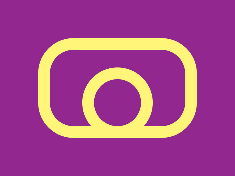
Solution
Firstly, we want to set the background to the right color (#92278F) and also center the future div's we are going to add using flexbox
<div></div>
<style>
  body{
    background: #92278F;
    /* center using flexbox */
    display: flex;
    justify-content: center;
    align-items: center;
  }
</style>

Now we can start on the outside rounded rectangle.
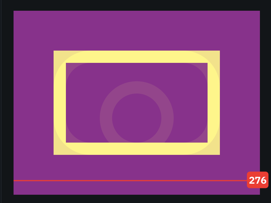
We're going to give the outside div an id (I chose sq) and give the new div width, height, and border properties. Adjust the properties to make the borders match the target borders.
<!-- New div 'sq'  -->
<div id="sq"></div>
<style>
  body{
    background: #92278F;
    display: flex;
    justify-content: center;
    align-items: center;
  }

  /* New css */
  #sq {
    border: 20px solid #FFF579;
    width: 230px;
    height: 130px;
  }
</style>
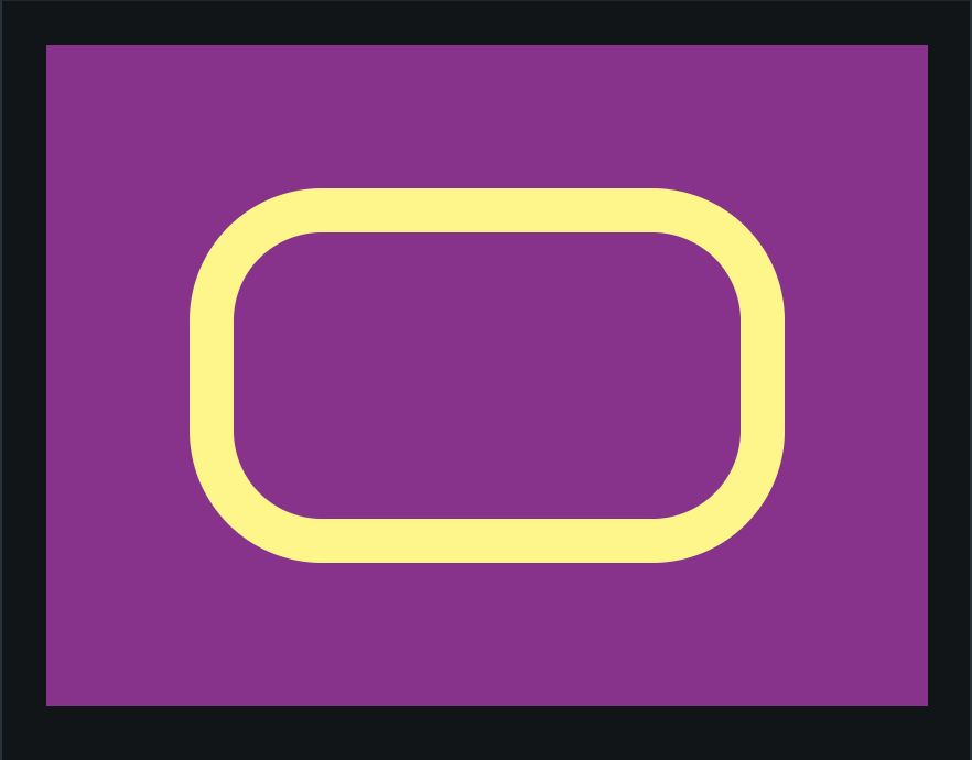
Now add the border radius matching the border radius of the outer square.
<div id="sq"></div>
<style>
  body{
    background: #92278F;
    display: flex;
    justify-content: center;
    align-items: center;
  }

  #sq {
    border: 20px solid #FFF579;
    width: 230px;
    height: 130px;
    /* new border radius */
    border-radius: 60px;
  }
</style>
Noe we can start on the inner circle
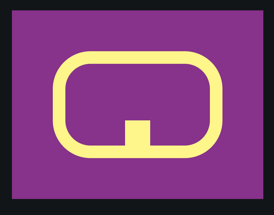
We can create a new div with a new id for the circle inside the square. I gave mine the id c It has the same border width and color, so we can reuse that property.
<div id="sq">
  <!-- added div -->
  <div id="c"></div>
</div>
<style>
  body{
    background: #92278F;
    display: flex;
    justify-content: center;
    align-items: center;
  }

  #sq {
    border: 20px solid #FFF579;
    width: 230px;
    height: 130px;
    border-radius: 60px;
  }

  /* new css */
  #c {
    border: 20px solid #FFF579;
  }
</style>
In the target, the circle is justified at the bottom of the square and aligned in the center. To achieve this, we can use flex properties on the outer square. Using flex-direction: column and justify-content: flex-end, we justify the circle to the bottom of the square. Now, using align-items:center, we can align the circle to the middle.
  #sq {
    border: 20px solid #FFF579;
    width: 230px;
    height: 130px;
    border-radius: 60px;
    /* Add flex properties */
    display: flex;
    flex-direction: column;
    justify-content: flex-end;
    align-items: center;
  }
Now all we have to do is adjust the c div to be shaped like a circle with the correct width and height.
  #c {
    border: 20px solid #FFF579;
    /* shape like a circle */
    border-radius: 10rem;
    width: 80px;
    height: 80px;
  }
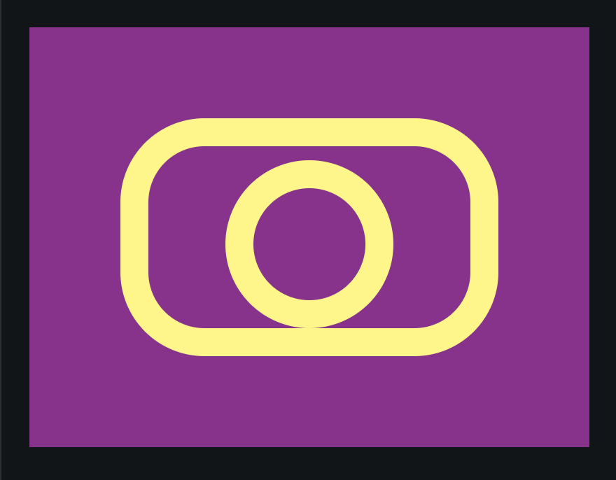
But wait, the circle in the target is inside of the border! To achieve this, we can use a negative margin the size of the border to pull the circle towards the bottom.
  #c {
    border: 20px solid #FFF579;
    border-radius: 10rem;
    width: 80px;
    height: 80px;
    /* negative margin-bottom */
    margin-bottom: -20px;
  }

And there you go! The render should now match the target 100%.
