CSS Battle Solution - Jan 12 2024
Daily Target

Solution
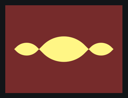
The focus of today's target is a group of 3 ovals. One large oval, and two smaller ones. The approach that we're taking is working on the large oval first, then using transform to create the small ovals.
As always, we start with setting the background of the body to the correct color (#762B2B) and center the divs using flex;
<div></div>
<style>
  body {
    background: #762B2B;
    display: flex;
    align-items: center;
    justify-content: center;
  }
</style>

Now, we can start with the lemon shape. We can add a div with the class lemon and set it's background to the correct color(#FFF685).
<div class="lemon"></div>
<style>
  body {
    background: #762B2B;
    display: flex;
    align-items: center;
    justify-content: center;
  }
  .lemon {
    background: #FFF685;
  }
</style>
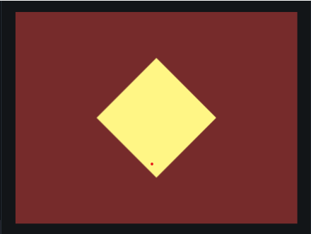
To create the lemon shape, we need to have a div with an equal width and height. This should make a square. Then, we can use transform: rotate to rotate the square 45 degrees to make a diamond shape.
.lemon {
    background: #FFF685;
    width: 120px;
    height: 120px;
    transform: rotate(45deg);
}


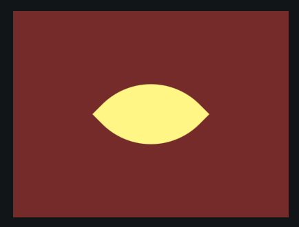
We can then use border-radius to add a curve to the top and bottom corners to make the lemon shape.
.lemon {
    background: #FFF685;
    width: 120px;
    height: 120px;
    transform: rotate(45deg);
    border-radius: 83% 0 83% 0;
  }

Now we can work on the two small lemon shapes.
To do this, we create copies of the lemon div.
<div class="lemon"></div>
<div class="lemon"></div>
<div class="lemon"></div>
<style>
  body {
    background: #762B2B;
    display: flex;
    align-items: center;
    justify-content: center;
  }
  .lemon {
    background: #FFF685;
    width: 120px;
    height: 120px;
    transform: rotate(45deg);
    border-radius: 83% 0 83% 0;
  }
</style>
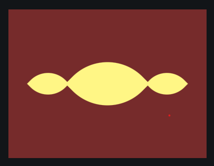
We can wrap the outer lemons with a div that scales itself down using transform to create smaller lemons.
<div class="sm">
    <div class="lemon"></div>
</div>
<div class="lemon"></div>
<div class="sm">
    <div class="lemon"></div>
</div>
<style>
...
.sm {
    transform: scale(50%);
}
</style>

Now we have one more problem: the smaller lemons are too close together. We can fix this using a number of approaches. I'm going to use margin for this solution.
<div class="sm" style="margin-right:7">
    <div class="lemon"></div>
</div>
<div class="lemon"></div>
<div class="sm" style="margin-left:7">
    <div class="lemon"></div>
</div>
And there you go, We have a 100% matching render!
Finished code:
<div class="sm" style="margin-right:7">
  <div class="lemon"></div>
</div>
<div class="lemon"></div>
<div class="sm" style="margin-left:7">
  <div class="lemon"></div>
</div>
<style>
  body {
    background: #762B2B;
    display: flex;
    align-items: center;
    justify-content: center;
  }
  .lemon {
    background: #FFF685;
    width: 120px;
    height: 120px;
    transform: rotate(45deg);
    border-radius: 83% 0 83% 0;
  }
  .sm {
    transform: scale(50%);
  }
</style>

